SlowBar
Sharing my coffee brewing passion project with the world
Discovery
4 Weeks
Design
3 Weeks
Support
4 Weeks
Role
Principal Designer
SlowBar
Sharing my coffee brewing passion project with the world
Discovery
4 Weeks
Design
3 Weeks
Support
4 Weeks
Role
Principal Designer
SlowBar
Sharing my coffee brewing passion project with the world
Discovery
4 Weeks
Design
3 Weeks
Support
4 Weeks
Role
Principal Designer
THE PRODUCT
This app is my baby and the spark for my journey into Product Design. SlowBar is the coffee brewing tool I initially designed for myself. I couldn’t have imagined it would resonate with so many and top 100,000 downloads in the App Store.
As a passion project that’s grown into something much bigger, it’s been immensely rewarding knowing that people all over the world are using it to make their daily brew easier and more enjoyable.
Since releasing the original version of the app, I’ve grown significantly in experience and proficiency as a UX designer and also had the opportunity to collect copious feedback from a wide range of users. Over the course of a few months I harnessed these components into a focused, start-to-finish effort on expanding SlowBar’s value proposition, community, and potential.
THE ASK
SlowBar is about bridging the gap between specialty coffee and the masses.
On my journey with coffee, I’ve been a newcomer, hobbyist, professional, and cafe owner.
Throughout it all, I’ve continually been astounded by the vastness and difficulty of crossing the knowledge gap. As a part of the industry, I’m incredibly privileged to have received the foundational training and principles surrounding coffee brewing and tasting, and with it, an ever-increasing appreciation and value for the art, science, and community of coffee.
But I am the exception.
Unfortunately, it is far more likely that a coffee travels all the way through the meticulously nurtured supply chain and reaches the average consumer who is unequipped to brew and enjoy the cup to its full potential. If the farmers, importers, roasters, and equipment manufacturers of the specialty coffee industry hope to sustainably grow market share, they face a significant obstacle: making the journey of coffee more accessible, approachable, and enriching for all.
I believe SlowBar can foster the community around coffee education for the masses, raise both the perceived value and actual value of specialty coffee, and connect industry stakeholders with this community.
Competitive Analysis
PROJECT STRATEGY
I am constantly studying design: places, objects, software, you name it. So a natural place to start building and validating the vision for SlowBar’s future was in looking at what is already available in the market and doing a thorough audit of the existing version of the app. It was a humbling and eye-opening process.
A heuristic analysis of SlowBar and two similar products identified areas of strength and a laundry list of needed improvements. It was painfully clear that my original design centered on basically one target audience: me.


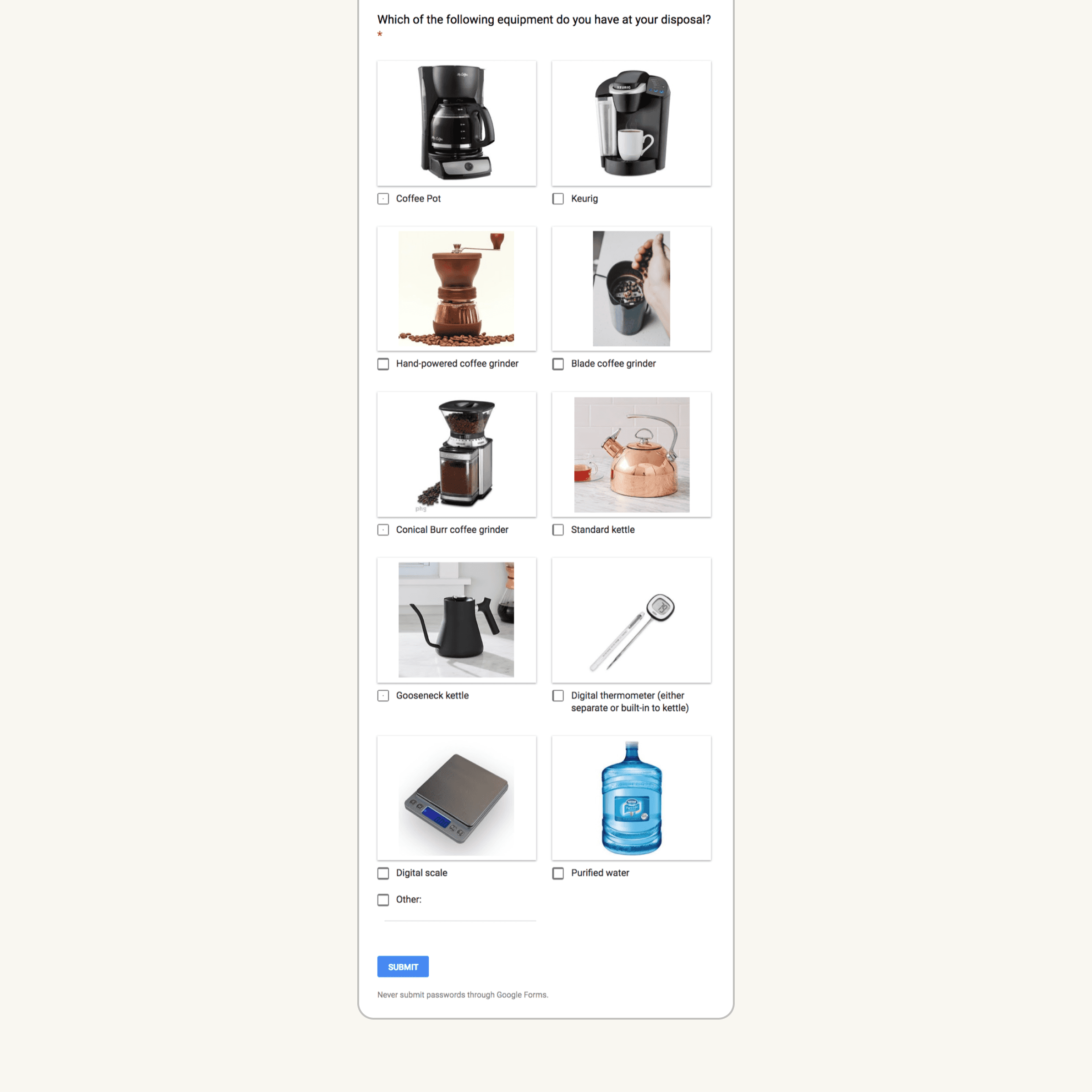
Survey
BUSINESS INTELLIGENCE
I learned quickly in UX to survey early and often. The goals for this round were to collect data from a diverse set of coffee drinkers to better understand each group’s context, pain points, and motivations. I kept the process simple and approachable, (less than 3 minutes to complete on Google Forms), injected some personality, and included examples and images to further aid clarity.
In a little over a week, I collected submissions from 26 respondents spread fairly evenly in age, gender, and skill level. It was incredibly encouraging that 80% of respondents make coffee at least 3-5 times a week, 60% lean more towards hand brewing than automated brewing, and 84% are either very or highly interested in learning more about coffee.
The time people would be willing to spend learning more about coffee was fairly diverse. This led me to start with a focus on developing educational content that could be consumed in 1-5 minutes, satisfying 100% of the user base.
Based on the equipment owned by 26 respondents, more solutions needed to be offered to help avoid breakdowns in experience. For example, only about half use a digital scale or thermometer, but all of SlowBar’s current brew guides only list measurements in temperature and grams.


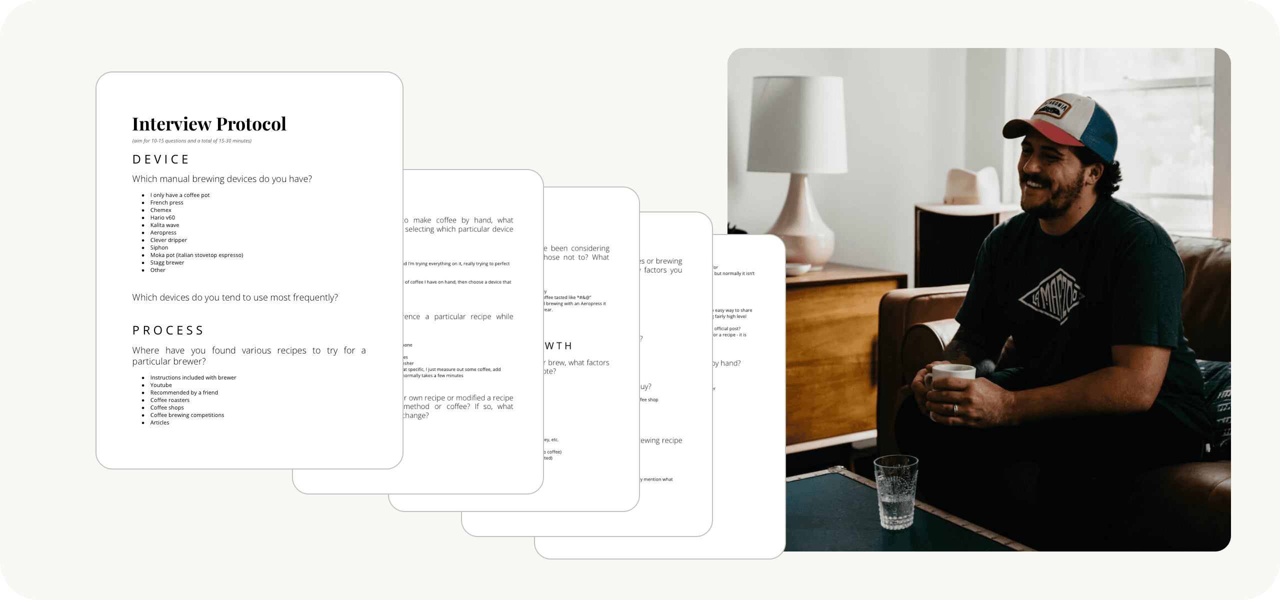
User Interviews
DISCOVERY
4 respondents were brought back for an in-depth interview to build upon the results from the survey and dig more into the “why” behind user actions, (qualitative data). To achieve this, I wrote 13 questions addressing the coffee brewing experience from start to finish. The more I could understand how people from all backgrounds approach brewing coffee, the better chance I’d have at designing a truly enjoyable and useful app to accompany them along the way.
Listening to people’s motivations, routines, and pain points around making coffee provided a ton of insight into how I could make the app more intuitive and truly helpful for anyone, regardless of skill level. One example: when a user was deciding how to brew a coffee, I realized the three most important factors that went into choosing a brewing device were the number of people to serve, level of difficulty, and the brew characteristics each device excels at creating.
One of the biggest revelations that came out of these interviews is the importance of visualizing the key techniques involved in each recipe. The potential of step-by-step video, gif, or photographs to lock in understanding cannot be overlooked.
Building in a coffee subscription that helps recommend roasters, regions, processes, and individual coffees (possibly even based on the user’s tastes) was an idea that was stumbled upon, explored, and could well become an important component of the business model. Without interviewing, I wouldn’t have seen as clearly the draw that a subscription feature possessed.
Pain points around brewing by hand include time constraint, dissatisfaction with the quality of brew, accessibility to good coffee, serving a group efficiently, and lack of direction for further improvement. These specifics can serve as checkboxes or benchmarks as I continue working to build a tool that grows people in their coffee knowledge, brewing, and enjoyment.
All four people had modified a brew recipe before, meaning that a high priority needed to be placed on adding in this functionality.
Most interviewees had favorite roasters or particular kinds of coffee, but all were also open to trying new coffees. Everyone enjoyed receiving recommendations from baristas or friends for different coffees or recipes and had also shared their own recommendations. This feedback suggested an important validation for the social aspects of the app.
The responses to my favorite question: “What do you love most about making coffee by hand?”, provided the foundation to build SlowBar’s voice, imagery, and branding. The theme centers on making people feel loved and welcomed, the sense of accomplishment that comes with honing a craft, and the mental and emotional state surrounding the ritual. This is a time to connect, savor, and slow down.

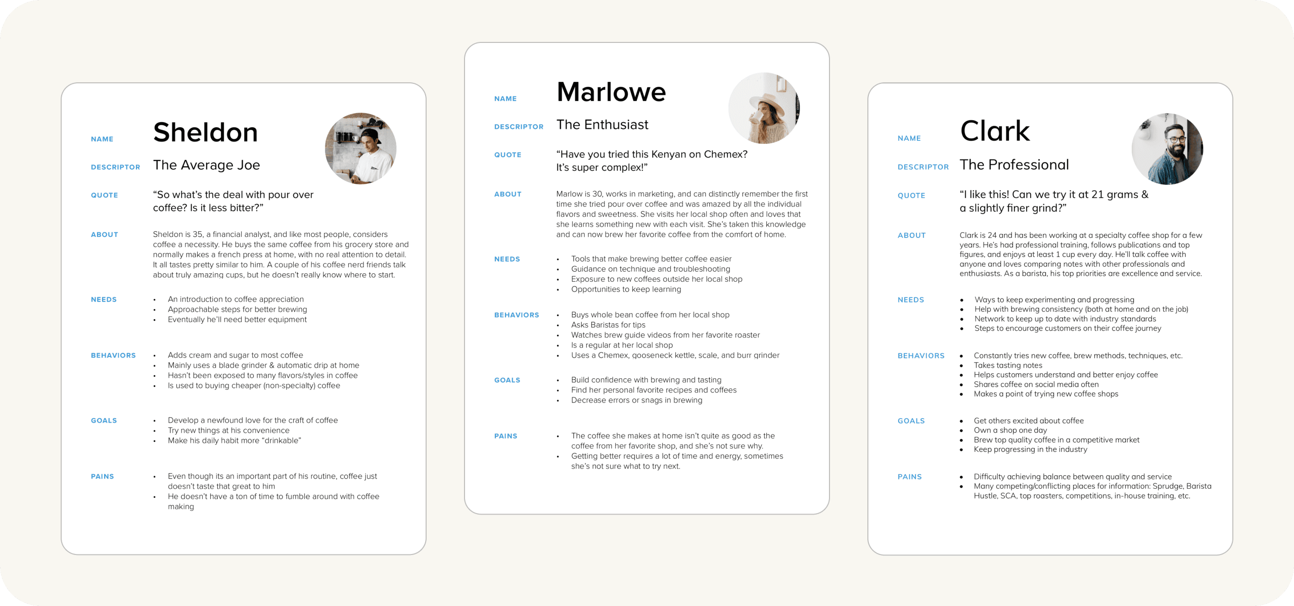
Personas & Empathy Maps
DISCOVERY
Using the findings from my competitive analysis, survey, and interviews, I established 3 distinct kinds of user to design for: The Average Joe, The Enthusiast, and The Professional. I then created a Persona & Empathy Map for each to better define these users and keep goals clear, whether making design decisions or working with project stakeholders.

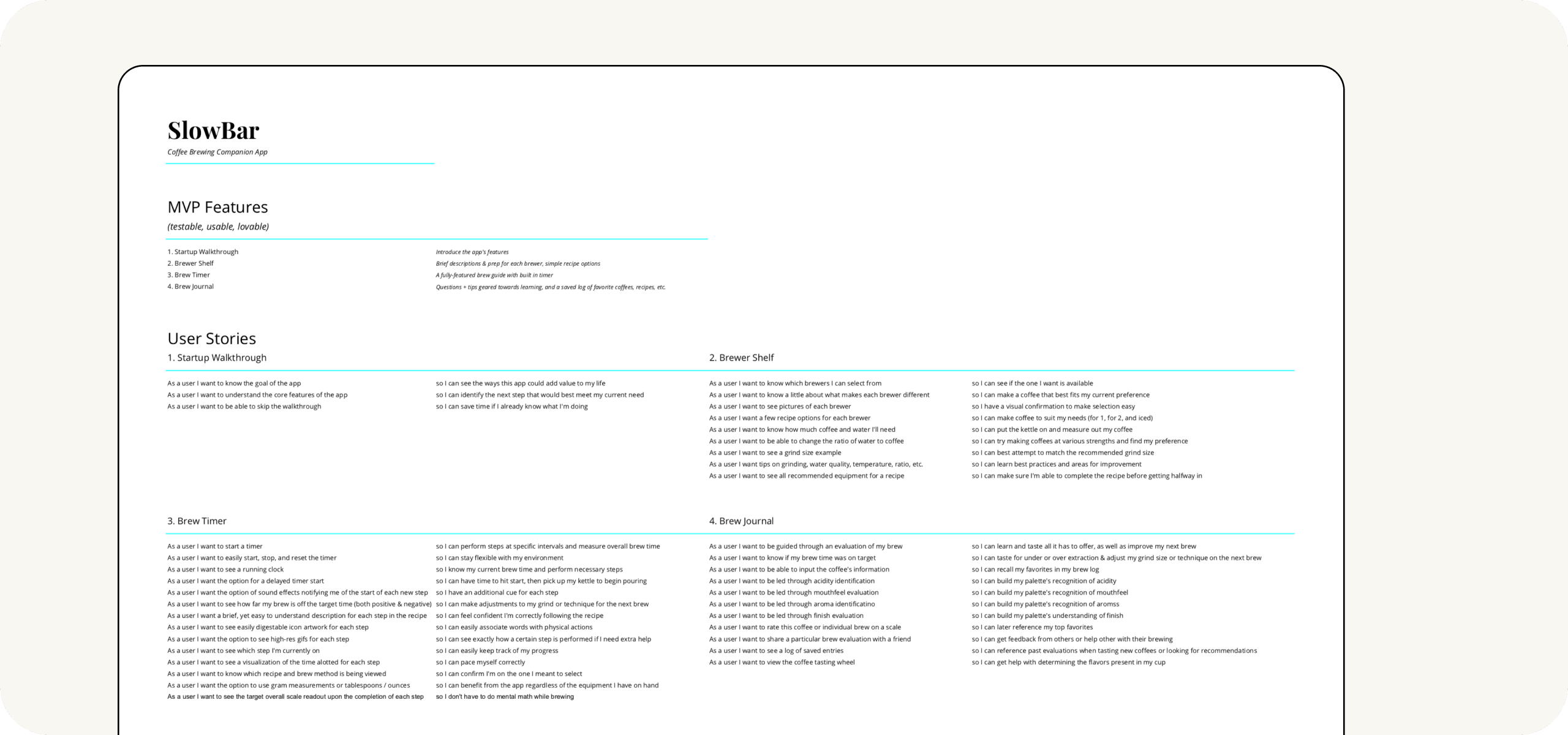
MVP & User Stories
IDEATION & PRIORITIZATION
Having a grand vision is great, but like so many examples before have displayed, building out projects for too long without any real feedback or validation from users often leads to disastrously wasteful results. I thought long and hard about what a Minimum Viable Product of SlowBar’s redesign needed to include at the barebones level to both provide a working model and an opportunity to engage with users in guiding future iterations.
Using the Lean Methodology along with all my prior research and feedback, I trimmed the list of added features and functionality down as much as possible, writing User Stories for each task to ensure I stayed on track and in the user’s perspective.
The largest components that were tabled for a future update were the store and coffee subscription service.
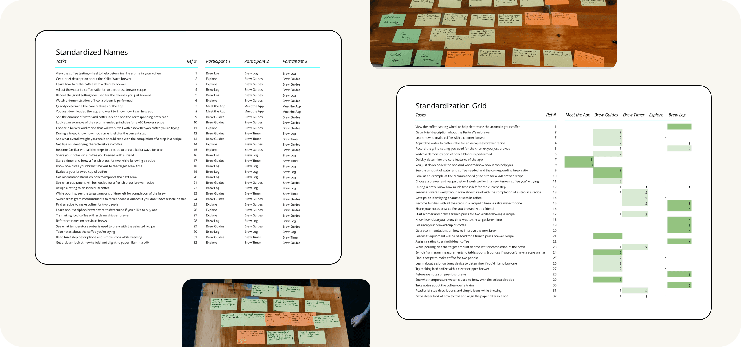
Card Sort
IDEATION & PRIORITIZATION
With a newly defined MVP, I conducted card sorts and built a sitemap with the results. This process was influential in developing a natural and intuitive information architecture for the app’s redesign.
Taking the time to dive into these details before prototyping or designing led to new improvements and prevented a number of potential oversights and wasted time.
To start the card sort, I first looked for 1 participant from each of the 3 persona backgrounds with the goal of getting a well-rounded perspective on how people would like to see the app organized.
Even just brainstorming the 30+ tasks necessary for the sort helped bring new ideas to the table. Conducting each sort was incredibly insightful; I found it especially helpful to listen as participants problem-solved out loud. While everyone had a fairly unique approach to completing the exercise, there were consistent patterns found in the final outcomes.
Although participants used a pretty good mix of verb-based and noun-based group descriptors, I ended up settling on the primarily noun-based groups of Brew Guides, Brew Timer, Explore, & Brew Log.
Seeing the number of different ways people could approach brewing, learning, or getting help was a huge factor in allowing me to let go of the idea of a rigidly linear flow for the app, and instead, provide multiple paths that encourage exploration while also maintaining the utility of an everyday tool.
Sitemap
PRODUCT STRATEGY
After distilling group names and sorting the data through a standardization grid, I began sketching out a sitemap. This was a really exciting process as I began to see the app take shape in a completely new, more fully-formed way.
Spending this crucial time in details and data reduced fuzziness around the overall vision and brought forth a more concrete and complete plan - something all stakeholders could already appreciate.

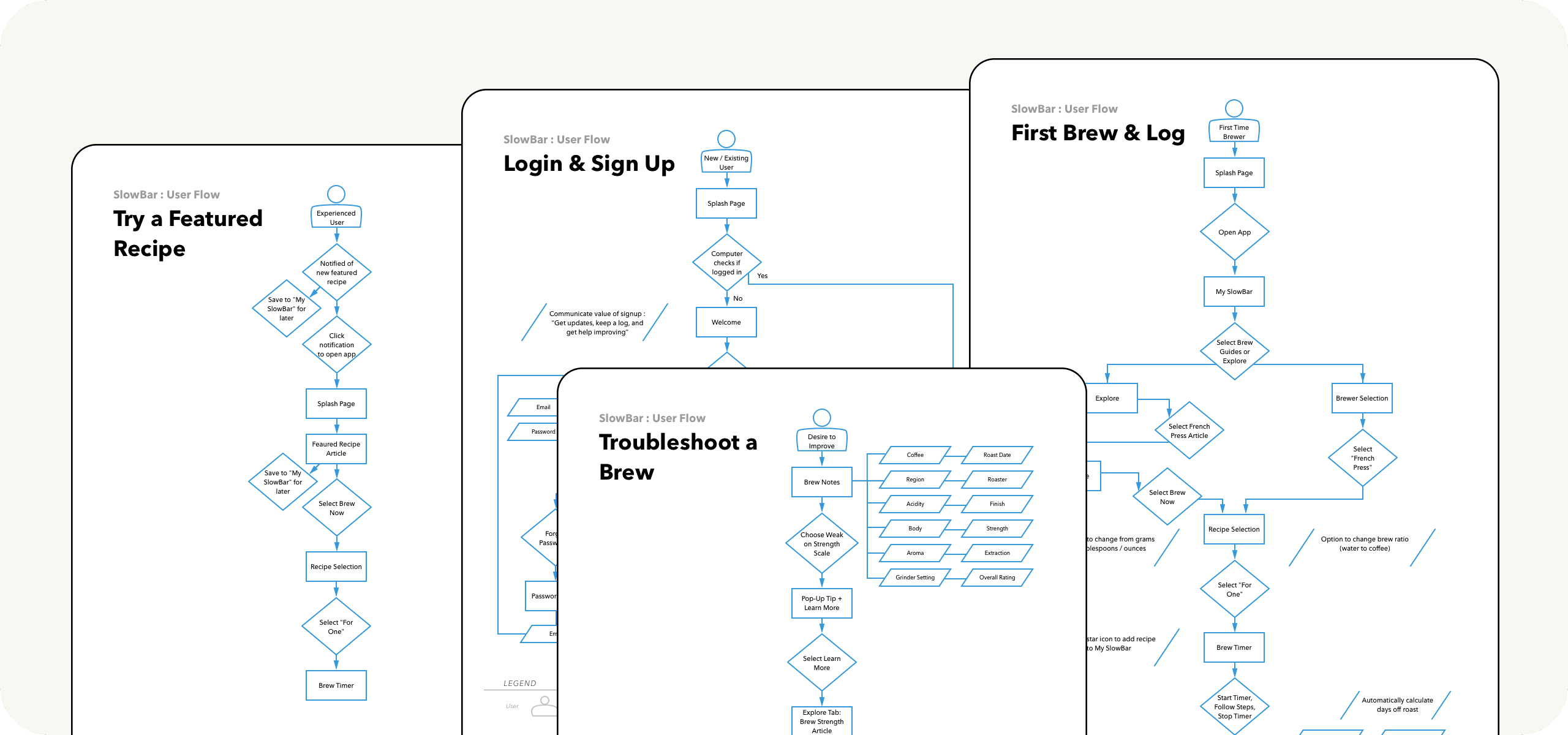
User Flows
PRODUCT STRATEGY
This phase of the project was where it really felt like the rubber met the road. All the features, organization, and user-centered thinking played out in nice start-to-finish flows that looked more and more like an app experience, while still keeping revisions easy and efficient in low fidelity.
After sketching out 4 different user flows, getting feedback from mentors and other stakeholders, and making a couple rounds of revisions, it was time to proceed to wireframing.
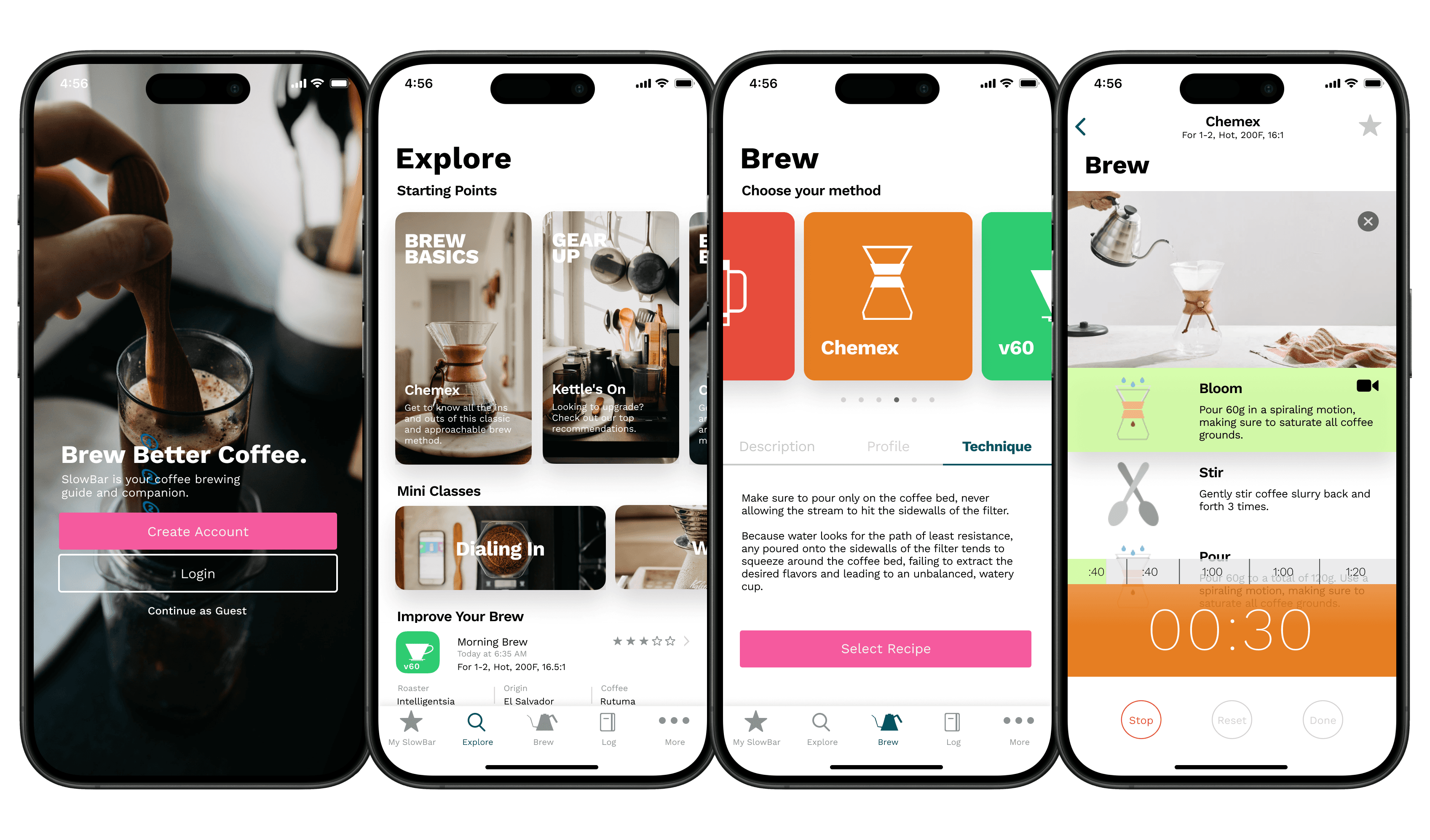
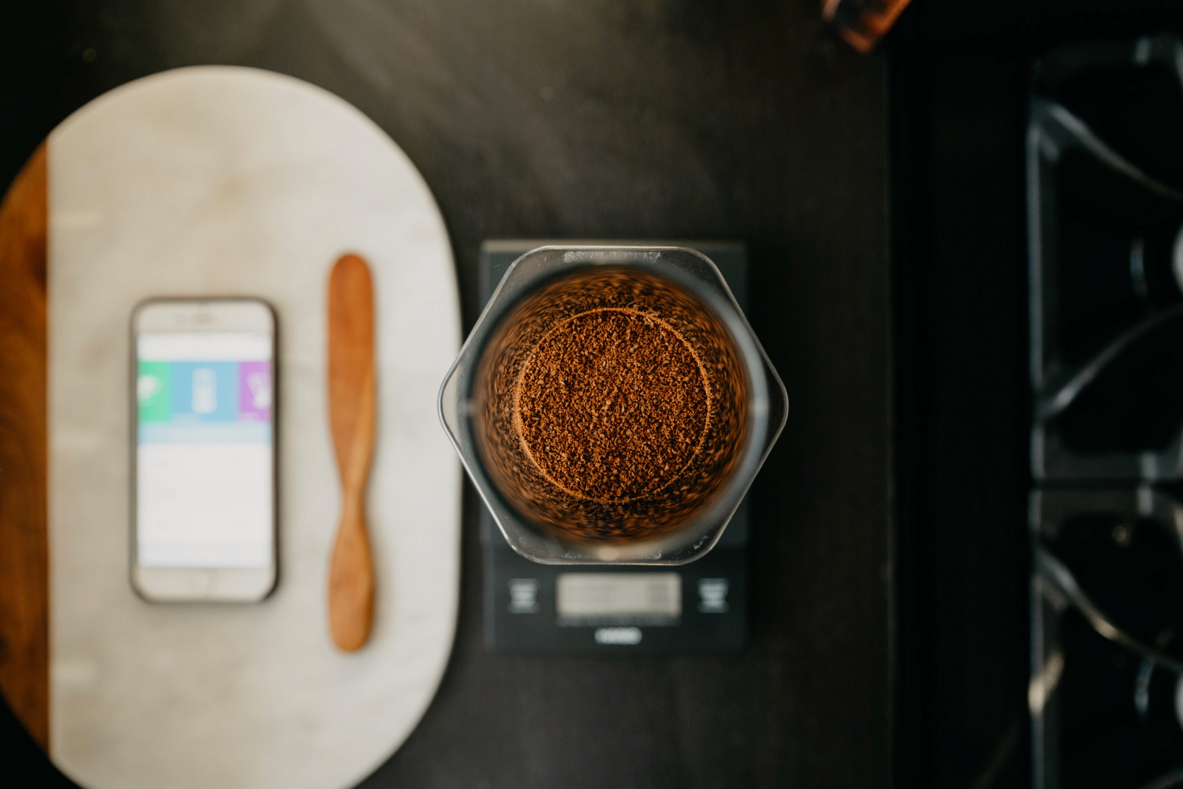
Wireframes
VISUAL DESIGN
With a solid foundation of vision, analysis, strategy, & validated research in place, I arrived at probably the most exciting and gratifying stage: sketching and wireframing.
Trying myriad layouts and getting quick feedback along the way, I learned the importance of staying flexible and keeping fidelity low at the beginning.

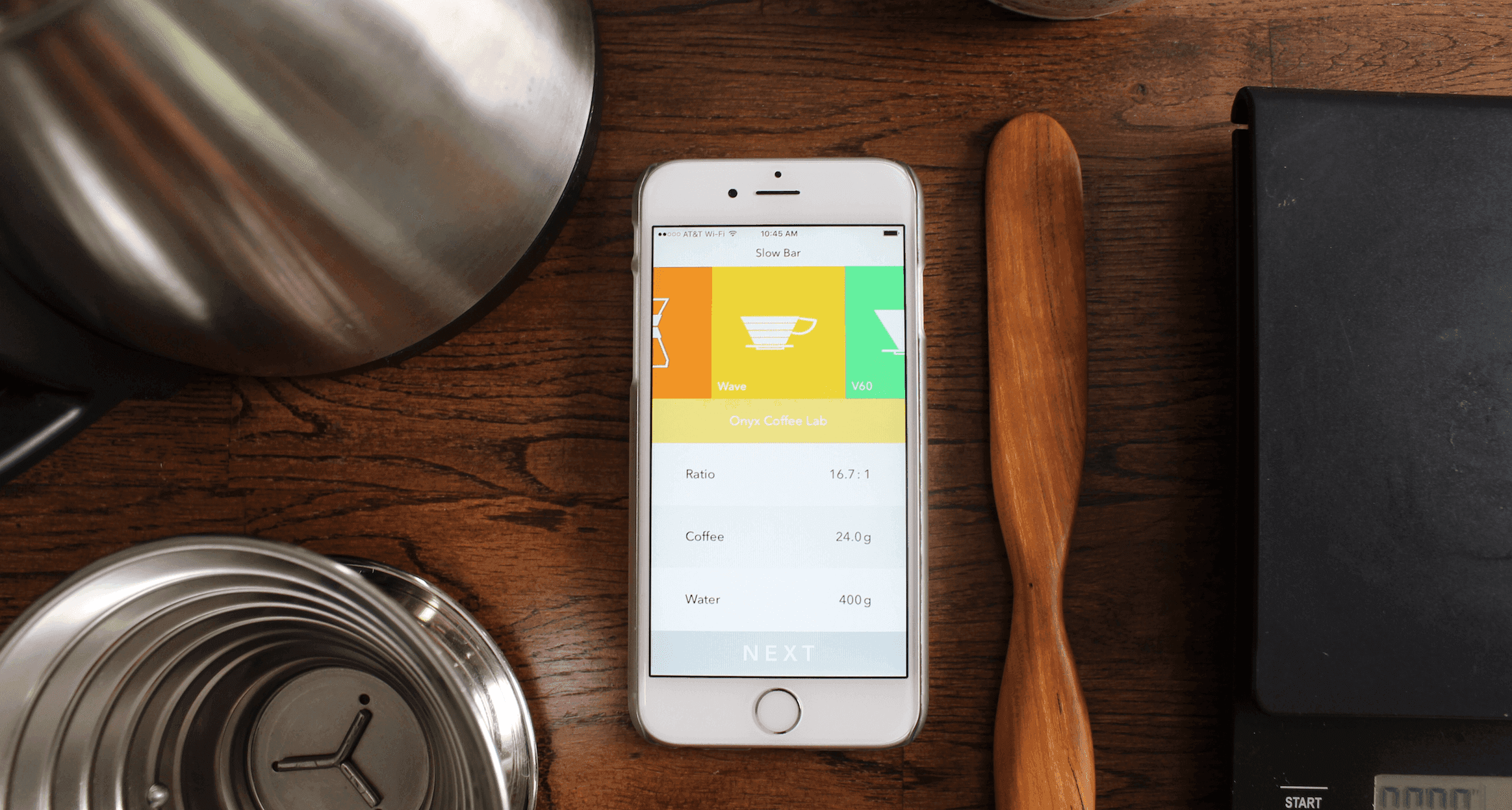
Prototype
IX DESIGN & TESTING
I moved pretty quickly to take even the most basic wireframes and get them into prototype form, knowing that the feedback value would only increase when letting friends, developers, and mentors test an actual experience. There were some moments that I definitely spent too much time seeking pixel perfection when the real goal of a prototype is to test function, flow, and try different solutions.
This phase of the process was where the value of designing modularly really clicked with me.
By choosing a particular function or design element to focus on, create a few different versions of, and then get feedback from stakeholders, I was able to keep iteration efficient and arrive at an ideal solution quickly.
The prototype was the first point in the project where considering interactions, animations, and gestures really started coming into play. To get a good grasp on what would make interactions intuitive and enjoyable, I studied 10 of my favorite apps. I asked questions like:
When is sliding right/left used as opposed to opening/closing? How do modals behave? When are labels or hints used? When is the tab bar present or hidden? Where are there opportunities for power user gestures?
Again, I started to build fidelity progressively, (especially since most prototyping tools have limitations), and I’m really happy with the natural and simple feel of the experience so far.
Brand Identity
VISUAL DESIGN
At last, it was appropriate to go through my prototype with a fine-toothed comb, make tweaks, and settle on a uniform and consistent style guide. I would label myself as highly attentive to detail, so this was a process I’d been anxiously anticipating.
Settling on the final colors & typography to utilize throughout every aspect of the app was a balancing act of fighting for simplicity while still retaining the ability to create meaning.
Too many coffee brands rely on the natural and earthy tones that can be derived from the coffee plant, including cherries, leaves, flowers, and roasted beans. I saw this as a perfect opportunity to set SlowBar apart, and selected colors that would help keep the experience fun, contextual, and encouraging.
My primary goal in typography selection was to reinforce the brand values of simplicity and approachability. While there are a number of different ways to achieve this, I opted to solely utilize the Work Sans typeface because of its sturdiness, excellent readability, sweet spot of flair, and ability to create plenty of visual hierarchy with a wide range of available weights.

Next Steps
PRODUCT STRATEGY
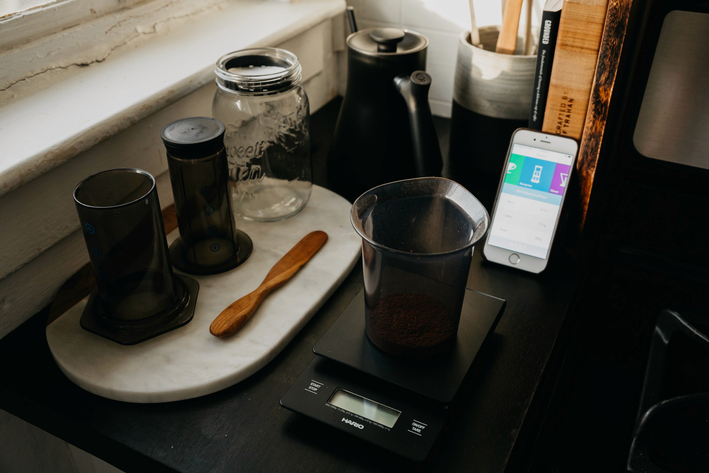
While anyone is welcome to check out the original version for free in the app store, I'm very excited to share that the redesign is currently in development for a beta release in TestFlight.
Next steps will be gathering feedback from testers and finishing out the rest of the content for each component including recipes, mini-classes, and imagery. I'm also developing a marketing launch plan and working on a case study with a coffee roaster to establish a pricing structure for advertising on the platform. Looking forward to sharing more!
Next Steps
PRODUCT STRATEGY
While anyone is welcome to check out the original version for free in the app store, I'm very excited to share that the redesign is currently in development for a beta release in TestFlight.
Next steps will be gathering feedback from testers and finishing out the rest of the content for each component including recipes, mini-classes, and imagery. I'm also developing a marketing launch plan and working on a case study with a coffee roaster to establish a pricing structure for advertising on the platform. Looking forward to sharing more!
“Collin is seen as a true expert in the design craft with amazing design skills, advanced Figma knowledge, and pushing the status quo with systems and foundations.”
Design Mentor
“Collin is seen as a true expert in the design craft with amazing design skills, advanced Figma knowledge, and pushing the status quo with systems and foundations.”
Design Mentor
“Collin is seen as a true expert in the design craft with amazing design skills, advanced Figma knowledge, and pushing the status quo with systems and foundations.”
Design Mentor
Design resources and journal


Design resources and journal
Design resources and journal
GET IN TOUCH
Got ideas?
Let's talk.
Thanks for stopping by ✌️
Made with love in Fort Worth, TX
GET IN TOUCH
Got ideas?
Let's talk.
Thanks for stopping by ✌️
Made with love in Fort Worth, TX
GET IN TOUCH
Got ideas?
Let's talk.
Thanks for stopping by ✌️
Made with love in Fort Worth, TX